Pops wrote: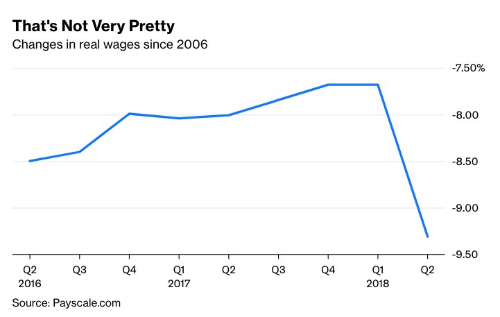
First, the pay scale chart looks wrong, and given the lack of explanation, citations, etc. doesn't look at all credible to me. Since it only covers from 2016, the timeframe is more about noise than a meaningful trend anyway. (I did the right click thing to see it on a different page to see the scale on the right).
Now, a credible site which gives a meaningful timeframe tells quite a different story.
United States Wages and Salaries Growth 1960-2018 | Data | Chart
Wages in the United States increased 4.89 percent in May of 2018 over the same month in the previous year. Wage Growth in the United States averaged 6.20 percent from 1960 until 2018, reaching an all time high of 13.77 percent in January of 1979 and a record low of -5.77 percent in March of 2009.
Now, this is nominal growth, so real wage growth would be more like 2.7% over the past 58 years. Or, eyeballing the 5 year chart, more like 2% (due to low inflation) over the past 5 years. Or if you want to use the past 2.5 years, more like 1.5% (again, very low inflation).
But NOTHING like the chart from payscale.com shows.
https://tradingeconomics.com/united-states/wage-growthGiven the track record of the perma-doomer blogs, I wouldn't bet a fast crash doomer's money on their predictions.


 After all, they are hard workers and we have lots of room.