Baduila wrote:The MOMR is available, and an update of the diagram i posted about four months ago follows. The dotted lines are unchanged, new values for oilprice and production are included.
The production cut of OPEC+ has lifted the price upward in the direction of the dotted green line. Next month it will be visible if all OPEC members follow the cut.
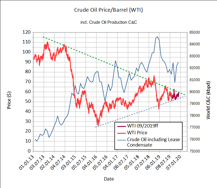
About four month remain until both dotted lines clash. I'm curious what will happen. What are your expectations ?
Your chart is nonsensical. If you're trying to project the prices re what the squiggly lines will do, you need to have the date scale CONSITENT at a minimum.
Sometimes, you show 10 months between data points, sometimes only 2, sometimes only 1, sometimes 11. All with the same horizontal date scale re the graph.
What the hell?
Fix the chart so the lines at least theoretically make some sort of sense re a consistent scale, then get back to us.
Meanwhile in the real world, since the ETP MAP price has been strongly exceeded by the real world WTI price consistently for years -- the map was badly broken as making any sense in 2018, and only is getting worse in 2019, so what in the world does looking for the next direction get you? Hopes and prayers that if it it will make 2020 look better for the already failed ETP MAP?
Remember, the MAP predicted WTI price for year end 2019 is about $27 and for year end 2020 is about $13 (me eyeballing shorty's MAP chart in his Version 2, March 1, 2015 ETP paper, page 34, pink 38% line), which he used to like to refer to a lot re how the MAP ensured financial doom by now. Clearly the whole paper has been shown to be a big FAIL, BTW.
Seriously, what's the point? To make the level of failure seem somehow less dismal IF the price breaks your way and the average WTI is only $40 in 2020, so the map is only off by 100% or so? Barring a major global recession REAL SOON NOW, good luck with even that. More likely, it ends up off by 200% or more for average prices for the year, and off by perhaps 300 to 500 percent or even more at end of year pricing.
And if that isn't good enough for you, what miracle do you have in mind for 2021, when the year end price is projected at perhaps $2? If WTI is at the current $60, it will be off by roughly 3 THOUSAND percent? Do you think forecasting the next chart wiggle will make salvage things at that point?
It's ironic, but what you're doing is a graphical representation of what most fast crash doomers do verbally. Try to change the rules, distort things, move the goal posts, jingle some keys, and pretend they're right, as they've always been re their predictions, so we should keep listening to them.
Sure. All COMPLETELY credible.