Page 1 of 1

Is the header supposed to look like this?

Unread postPosted: Sun 29 Dec 2013, 17:54:24
by Loki
Maybe it's because I'm using Ubuntu on a little 10" netbook, but the PO.com header looks a bit peculiar. "Exploring" and "Depletion" are overlapped so you can't really read them. This isn't new, been like this as long as I can remember, but I'm bored today so figured I'd ask.
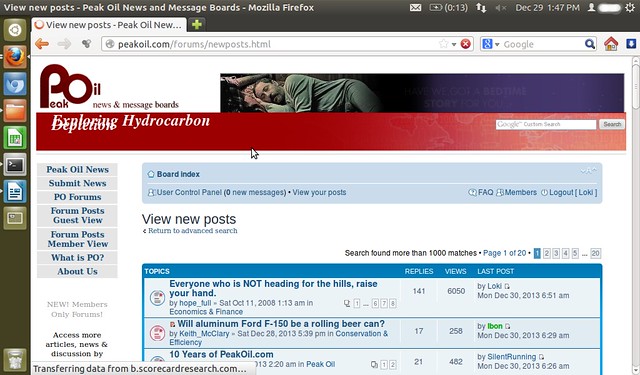
Image

Re: Is the header supposed to look like this?

Unread postPosted: Sun 29 Dec 2013, 18:14:06
by Pops
It's just live text typed into a form on a stock template. We're not into all that "look and feel" stuff here, LOL

Re: Is the header supposed to look like this?

Unread postPosted: Sun 29 Dec 2013, 20:48:29
by Loki
Pops wrote:It's just live text typed into a form on a stock template. We're not into all that "look and feel" stuff here, LOL

Admin could probably just put something shorter in there. Like "DOOM DOOM DOOM!" :lol:

Or maybe just increase the size of the text box a bit. Plenty of empty room to the right of it.

Re: Is the header supposed to look like this?

Unread postPosted: Mon 30 Dec 2013, 14:47:58
by Quinny
Mine looks fine :)