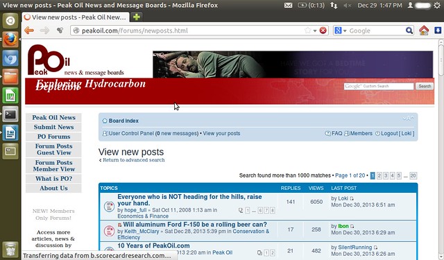
Is the header supposed to look like this?
Maybe it's because I'm using Ubuntu on a little 10" netbook, but the PO.com header looks a bit peculiar. "Exploring" and "Depletion" are overlapped so you can't really read them. This isn't new, been like this as long as I can remember, but I'm bored today so figured I'd ask.